
Introduction
A blank wall is a missed opportunity. Walls are the biggest surfaces in any room, and what you do with them sets the mood more than almost anything else. Blue is a perfect color to work with because it can be soft and calming as a backdrop or bold and eye-catching as a statement.
As an Amazon associate, we may earn a commission if you make a purchase through these links, at no additional cost to you.
You don’t need to repaint the whole house to make an impact. A single accent wall, one oversized blue print or a few well-styled shelves can turn a forgettable wall into the focal point of the room. This guide covers a wall-ready color palette, the key pieces to look for, accent wall, art and shelf ideas, plus hanging tips, mistakes to avoid and quick answers to common questions.
Color Palette for Blue Wall Decor
- Cobalt Blue (#0047AB): Make a statement with abstract artwork or a bold accent wall.
- Teal Blue (#367588): Add depth to painted shelves or bring color into framed prints.
- Powder Blue (#B0CDE0): Create a softer look with pale blue accent walls or picture-frame mats.
- Navy Blue (#1D2B45): Use as a rich backdrop for wall paneling or a gallery wall.
- Gallery White (#FAFAF7): Balance the blues with warm white frames, mats, and surrounding walls.
- Light Oak (#C9A97A): Introduce natural warmth through wood frames and floating shelves

Key pieces
- Large-scale blue abstract or ocean art
- A set of two or three matching blue prints
- Floating shelves in wood or painted blue
- Paint, peel-and-stick wallpaper or wall molding
- A round or arched mirror with a blue or brass frame
- Blue-and-white plates or ceramics for a plate wall
- Woven or textile wall hangings in indigo
Accent wall ideas
Classic painted wall: Paint the wall behind the sofa or bed in a saturated blue. It’s the cheapest high-impact change you can make. Test two or three sample swatches on the wall and look at them in morning and evening light before you commit. A matte or eggshell finish hides wall imperfections and gives the color a rich, velvety depth
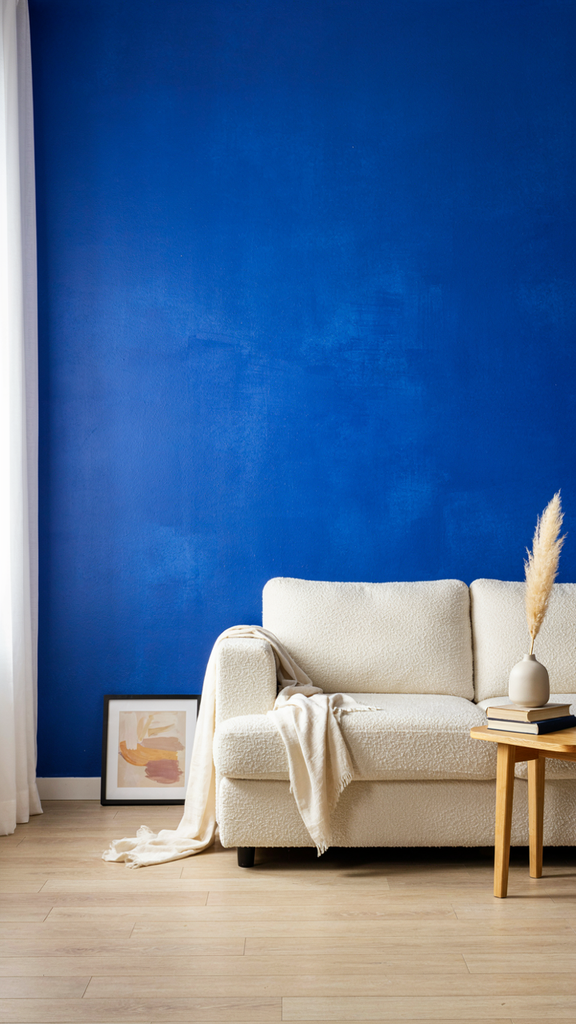
- Color palette: Cobalt (#0047AB) or Navy (#1D2B45), Gallery White (#FAFAF7), Light Oak (#C9A97A)
- Key pieces: Matte or eggshell paint, sample swatches, quality roller and angled brush, painter’s tape
- Styling tips: Paint the wall your eye lands on first, and repeat the blue in a pillow or throw across the room so it feels connected.
Two-tone wall: Paint the bottom third navy and the top white, with a chair rail or a clean tape line between them. The darker color on the bottom grounds the room and hides scuffs, which makes this a smart choice for hallways, kids’ rooms and dining rooms. Use painter’s tape and a level for a crisp, professional-looking line.

- Color palette: Navy (#1D2B45), Gallery White (#FAFAF7), brushed brass
- Key pieces: Chair rail molding, level, painter’s tape, scuff-resistant paint for the lower section
- Styling tips: Place the line about one-third up the wall (roughly 32 to 36 inches) and hang art so it sits fully above the line.
Molding and paint: Add picture-frame molding, board and batten or slats, then paint the whole wall one blue for a custom look. Painting the trim and wall in the same color is called color drenching, and it makes even simple molding look high-end. Most molding kits can be installed in a weekend with a miter saw, construction adhesive and a nail gun.
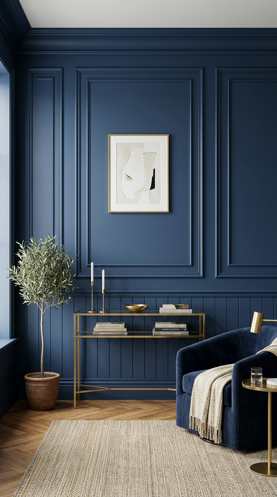
- Color palette: Navy (#1D2B45) or Teal Blue (#367588), Gallery White (#FAFAF7), Light Oak (#C9A97A)
- Key pieces: Picture-frame molding kit or board-and-batten strips, caulk, wood filler, one-color paint for wall and trim
- Styling tips: Use an eggshell or satin finish so the molding’s shadows show. Keep art minimal; the paneling is already the decoration.
Wallpaper: Try peel-and-stick in a blue botanical, stripe or geometric pattern. It’s great for renters. Choose a larger pattern for big walls and a smaller one for powder rooms or nooks. Smooth each panel from the top down with a plastic smoother to avoid bubbles, and line up the pattern before you press it flat.
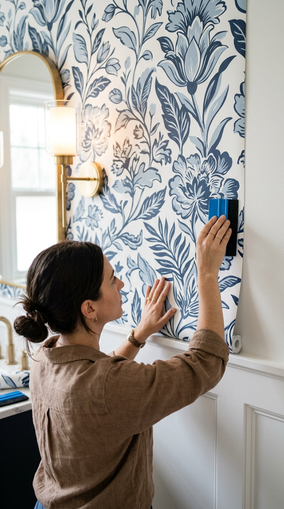
- Color palette: Powder Blue (#B0CDE0), Navy (#1D2B45), Gallery White (#FAFAF7)
- Key pieces: Peel-and-stick wallpaper (botanical, stripe or geometric), plastic smoother, sharp utility knife
- Styling tips: Pull one color from the wallpaper for nearby pillows or a lamp, and keep the other walls a plain soft white.
Painted arch: Paint a blue arch behind a bed, desk or console to frame it without any construction. Use a pencil tied to a string as a compass to draw a perfect curve, then tape the edges and paint. It’s a fun weekend project that adds architecture to a plain wall and looks especially good in kids’ rooms and home offices.
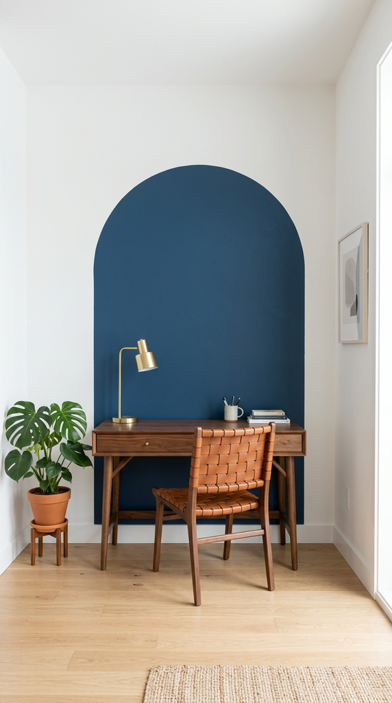
- Color palette: Teal Blue (#367588) or Powder Blue (#B0CDE0), Gallery White (#FAFAF7), Light Oak (#C9A97A)
- Key pieces: Sample pot of paint, string and pencil compass, flexible painter’s tape, small foam roller
- Styling tips: Make the arch slightly wider than the furniture it frames, and stop it 6 to 12 inches below the ceiling for good proportions.
Art ideas
- One oversized piece: A big blue abstract above the sofa feels gallery-worthy and simple. Look for pieces at least 36 to 48 inches wide so the art holds its own against the sofa. Affordable options include large canvas prints, framed fabric or even painting your own abstract.

Color palette: Navy, denim blue, and soft ivory with touches of warm wood.
Key pieces: One oversized blue abstract, a slim wood or black frame, and coordinating throw pillows.
Styling tips: Center the artwork above the sofa and keep nearby accessories minimal so it remains the focal point. Repeat one shade of blue in a pillow or throw to tie the room together.
- Gallery wall: Mix blue prints, photos and a small mirror in matching frames. Start with your largest piece in the center and build outward, keeping the outer edges roughly even. Add one object, like a small woven basket or a wall plate, to break up the frames and add dimension.

Color palette: Navy, sky blue, and crisp white with natural woven accents.
Key pieces: Blue art prints, personal photos, a small mirror, matching frames, and a woven basket or decorative wall plate.
Styling tips: Lay out the arrangement on the floor before hanging. Keep spacing consistent, distribute blue tones throughout, and place the three-dimensional accent slightly off-center for balance.
- Diptych or triptych: Two or three prints that work as a set fill a wide wall neatly. Hang them in a straight line with the same spacing between each, about 2 to 3 inches. This works especially well above a bed, console table or long dining sideboard.
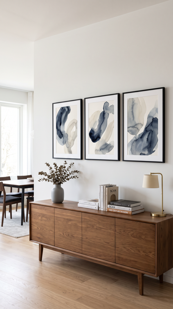
Color palette: Navy, slate blue, and soft white with subtle gray accents.
Key pieces: A two- or three-piece blue art set, matching frames, and a few simple accessories in coordinating tones.
Styling tips: Center the full arrangement above the furniture rather than centering each print separately. Use matching frame sizes for a cohesive look, and keep nearby decor understated so the artwork stands out.
- Plate wall: Hang blue-and-white plates in a cluster for a traditional or cottage look. Mix sizes and patterns but keep the colors to blue and white so the cluster looks cohesive. Inexpensive wire or adhesive plate hangers make it easy, and thrift stores are a great source for vintage plates.

Color palette: Cobalt blue, porcelain white, and soft cream with warm wood accents.
Key pieces: Blue-and-white plates in assorted sizes, suitable plate hangers, and a larger platter to anchor the arrangement.
Styling tips: Arrange the plates on the floor before hanging. Place the largest plate near the center, then balance smaller plates around it. Leave enough space between pieces to let their shapes and patterns stand out.
- Textile art: An indigo tapestry or framed fabric adds softness and texture. Hang a tapestry from a wooden dowel or brass rod for an easy, boho feel. Textiles also absorb sound, which helps in rooms with hard floors and high ceilings.
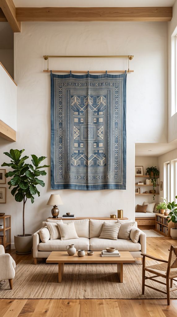
Color palette: Indigo, faded denim, and warm ivory with natural wood or brass accents.
Key pieces: An indigo tapestry, a wooden dowel or brass hanging rod, or patterned fabric in a simple frame.
Styling tips: Let the textile take center stage against a light, neutral wall. Echo its colors in a throw pillow or rug, and pair it with woven baskets or wood furniture for a relaxed, layered look.
Shop these ideas

|

|

|
|
$129.99
|
$109.99
|
$169.99
|
Shelf ideas
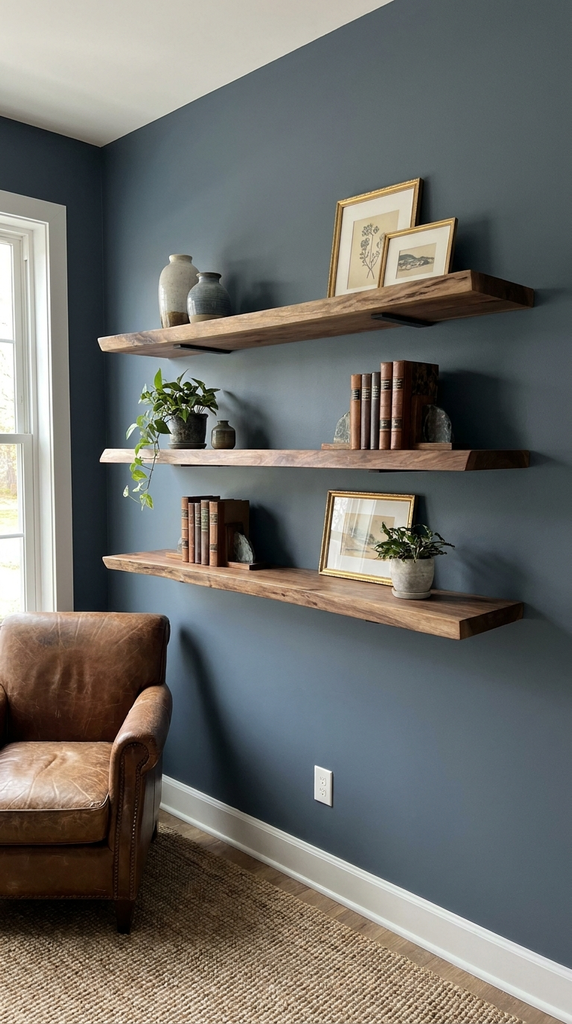
- Floating wood shelves on a blue wall: The contrast makes the shelves stand out. Light oak or walnut both look lovely against blue, and two or three staggered shelves feel more relaxed than a perfect stack. Use hidden brackets for a clean, floating look.
- Blue-painted built-ins: Paint the back of bookshelves blue for a hidden pop of color. The blue backing makes white ceramics, books and plants stand out, almost like a display case. If painting feels permanent, cut blue fabric or wallpaper to size and attach it with removable tape.

- Styled shelves: Mix books, blue ceramics, a plant and a small framed print on each shelf. Stack some books vertically and some horizontally to create varied heights, and use a horizontal stack as a base for a small object. Zigzag your blue pieces across the shelves so the color is spread evenly.
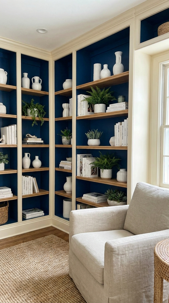
- Color palette: Teal Blue (#367588) or Navy (#1D2B45) backdrop, Light Oak (#C9A97A), Gallery White (#FAFAF7)
- Key pieces: Floating oak shelves, blue and white ceramics, books, a small plant, a mini framed print
- Styling tips: Fill each shelf about two-thirds full, group objects in threes and mix tall, medium and low pieces on every shelf.
Styling tips
- Hang art at eye level. The center of the piece should be about 57–60 inches from the floor.
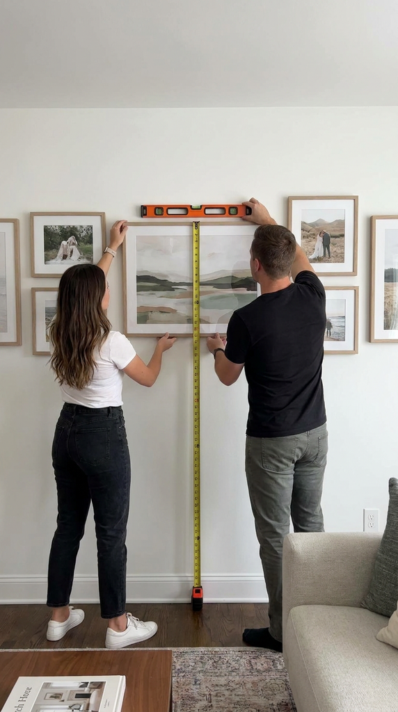
- Size art to the furniture. Above a sofa or bed, art should be about two-thirds of the furniture’s width.
- Plan a gallery wall on the floor first, or tape paper templates to the wall before you hang anything.
- Leave breathing room on shelves. Fill about two-thirds of the space and leave the rest empty.
- Style in odd numbers. Groups of three or five objects look more natural than pairs.
- Repeat the blue. Echo the wall color in a pillow, throw or rug nearby.
Mistakes to avoid
- Choosing the wrong accent wall. The best accent wall is the one your eye goes to first, usually behind the bed or sofa, not the wall with the door.

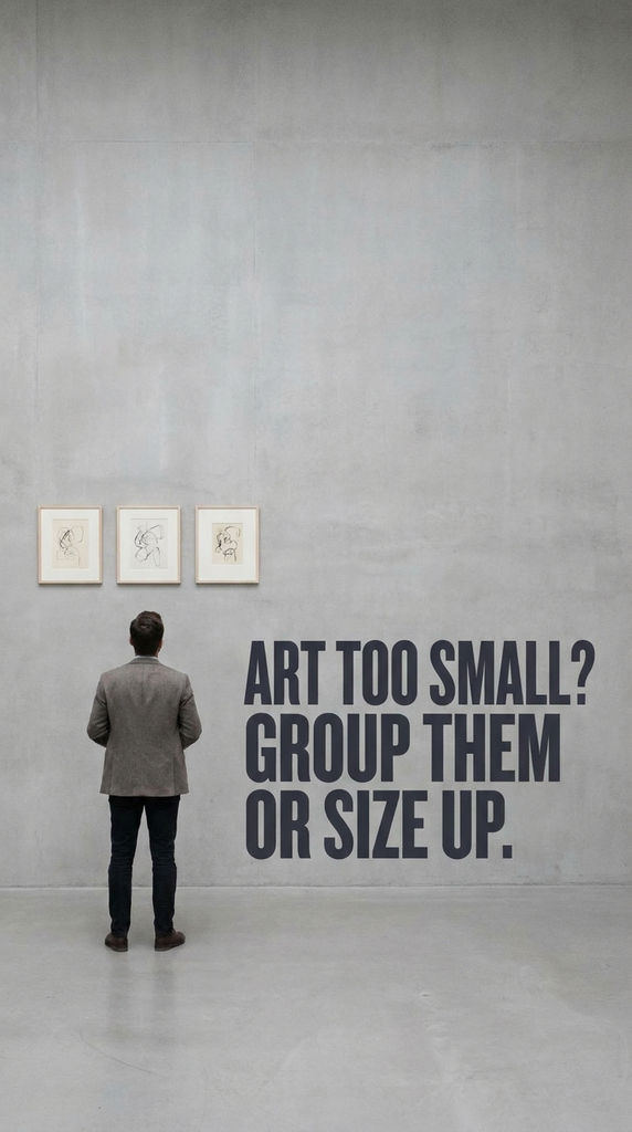
- Art that’s too small. Small pieces on a big wall look lost. Group them or size up.
- Mixing too many frame styles. For a gallery wall, keep frames in one or two finishes so the art stands out.

- Overstuffed shelves. Packed shelves look cluttered. Leave space between groupings.

Final Thoughts
Blue wall decor can bring a fresh, inviting feel to your home, whether you choose a bold accent wall, a favorite piece of art, or shelves styled with blue accents.
The key is to find shades and pieces that complement your space and reflect your personal style. Start with one detail you love, build around it, and let your blue wall decor tie the room together.
Blue wall decor FAQ
Which wall should be the accent wall? Usually the focal wall: behind the bed, behind the sofa or the wall you see first when you walk in.
What color frames go on a blue wall? White and gold frames pop against blue. Natural wood adds warmth, and black looks modern.
Can I do a blue accent wall in a rental? Yes. Peel-and-stick wallpaper, removable decals, large art or a leaning mirror give a similar effect without paint.
What art looks good on a navy wall? Art with lots of white, cream or gold stands out best. Black-and-white photography also looks striking on navy.
How far apart should gallery wall frames be? Aim for about 2–3 inches between frames for a tidy, connected look.
Blue wall decor is one of the fastest ways to give a room personality. Start with paint or one great piece of art, and build from there.