

Introduction
Our five picks for a moody fall living room are burgundy and cream, chocolate and caramel, plum and sage, mustard and navy, and oxblood and olive, each grounded by earthy finishes and softer accents. Beige and gray sofas provide an effortless starting point: richer fall colors add depth through pillows, throws, and art while your existing furniture stays in place.

We like a fall color palette that feels comfortable beyond October. Burgundy brings wine-red warmth; plum adds a quieter purple note. Chocolate, mustard, and oxblood offer different levels of richness, so you have room to choose autumn colors that suit your light and the pieces you already own.
Three Softly Moody Palettes for an Easy Refresh

For a gentle refresh, we recommend keeping light neutrals on larger surfaces and adding depth through muted upholstery accents. These combinations work with familiar beige or gray seating and leave plenty of room for warm wood.
Burgundy and Cream: Classic, Cozy, and Beginner-Friendly
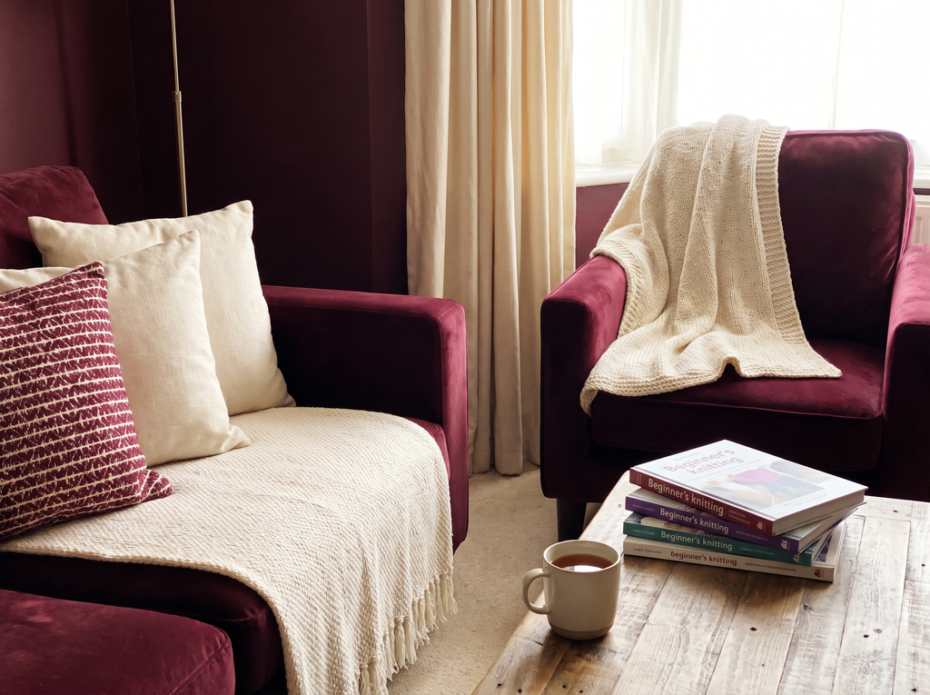
Swatch: Burgundy #6F2938 · Warm cream #F1E6D3 · Camel #B98B60 · Brass #AD8B4A
Our easiest starting point pairs wine-colored accents with a generous cream base. Camel connects the burgundy to oak furniture and warm brown floors, while brass adds a small glint.
Keep your beige sofa and introduce burgundy at opposite ends of the seating area. With a cool gray sofa, place a cream throw beside the red to soften the transition. In a dim room, let cream take the largest share.
Easy swaps:
- Burgundy velvet pillow covers
- Warm cream wool throw
- Camel-striped lumbar pillow
- Brass picture frame
These HEX values, and the swatches below, are digital approximations. Paint, fabric, leather, and metal finishes need physical samples; a flat gold swatch cannot show brass’s sheen.
Chocolate and Caramel: Rich Neutrals That Feel Grounded

Swatch: Chocolate #493229 · Caramel #B87943 · Tan #C8AB86 · Off-white #F3EDE2
On an off-white sofa, use chocolate pillows and a caramel throw. With an existing brown leather sofa, bring in tan linen and a pale rug to separate the dark seating from the floor. Repeat one wood tone in a frame or tray if your furniture finishes vary.
Easy swaps:
- Chocolate corduroy pillow cover
- Caramel woven throw
- Tan linen lampshade
- Off-white textured rug
For rooms with strong afternoon sun, check that caramel retains the earthy tone you want as the light shifts.
Plum and Sage: Muted Color with a Softer Mood

Swatch: Plum #604355 · Dusty sage #9DA58E · Warm gray #B4ADA4 · Antique gold #A48955
Plum and dusty sage are our pick for a softer, gently colorful living room. A warm gray base keeps the pairing restrained; taupe or mushroom upholstery also fits comfortably.
Use sage across a throw or curtains, then add smaller plum accents. Pale oak supports the softer mood, while dark wood gives the scheme extra depth. Beside a gray sofa, compare the sage sample with the upholstery so its green remains clear.
Easy swaps:
- Muted plum velvet pillow
- Dusty sage throw
- Warm gray patterned rug
- Antique-gold frame
Test this pairing carefully in low light. Some sage fabrics look gray in shadow, and deep plum loses detail when the room has little illumination.
Two Bolder Palettes for a Collected Living Room

Mustard with navy brings lively contrast, while oxblood with olive creates a deeper, library-inspired mood. We recommend letting one strong color lead and using the other in smaller areas.
Mustard and Navy: Vintage Warmth with an Energetic Edge
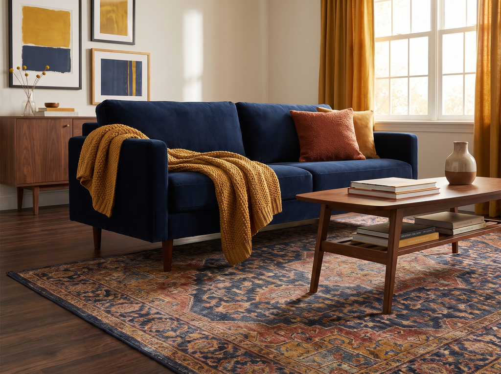
Swatch: Mustard #B78A2E · Navy #233549 · Rust #A55335 · Walnut #604332
This is our most energetic choice, with golden mustard warming the navy and rust linking both colors to walnut furniture. A faded patterned rug helps the combination feel collected.
If you have a navy sofa, add mustard through a throw and rust through one pillow. For beige seating, begin with a navy-patterned rug, then repeat mustard in artwork. Existing walnut tables already supply one of the palette’s main colors.
Easy swaps:
- Mustard wool throw
- Navy-and-cream patterned pillow
- Rust ceramic vase
- Walnut picture frame
Keep some pale wall space or a light lampshade around the seating area. In a room with charcoal upholstery, choose a navy sample that remains visibly blue beside the sofa.
Oxblood and Olive: Dramatic, Library-Inspired Depth
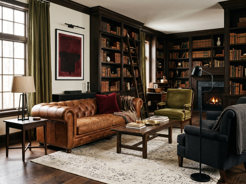
Swatch: Oxblood #54252C · Olive green #737448 · Soft black #292725 · Aged leather #94603F
Easy swaps:
- Oxblood velvet pillow
- Olive woven throw
- Soft-black reading lamp
- Aged-leather tray
Moss green offers an earthier variation if your existing rug already includes it. Keep deep reds concentrated in a few visible places so their color remains distinct from the surrounding brown.
How Can You Bring These Colors Home This Weekend?
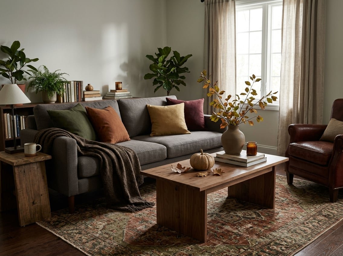
Our weekend approach starts with your existing sofa and one textile that connects the colors you want. Build the autumn color palette around those pieces, then check the result before buying larger items.
Use the 60-30-10 Rule as a Flexible Starting Point
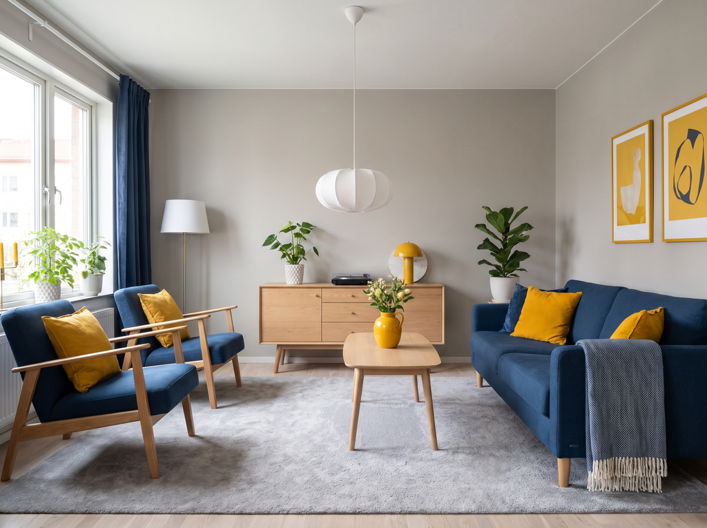
We use 60-30-10 as a rough guide to visible color, with about 60% in a dominant shade, 30% in a supporting color, and 10% in accents. Walls and flooring count toward those proportions.
For burgundy and cream, your light walls and sofa might form the 60%, camel textiles and wood the 30%, and burgundy the remaining accents. Treat brass as a finishing detail. There is no need to measure each surface.
Refresh Pillows, Throws, Rugs, and Art Without Painting

For a quick change, we suggest two pillow covers and a throw, followed by a print that repeats one of their colors. Shop your own rooms first for a suitable frame or vase.
Natural textures help connect the additions to existing furniture. Jute rugs bring a coarse weave, oak adds visible grain, and clay pottery contributes a matte finish. Choose a softer wool rug if your living room includes floor seating.
Consider an Accent Wall, Painted Trim, or Velvet Seating
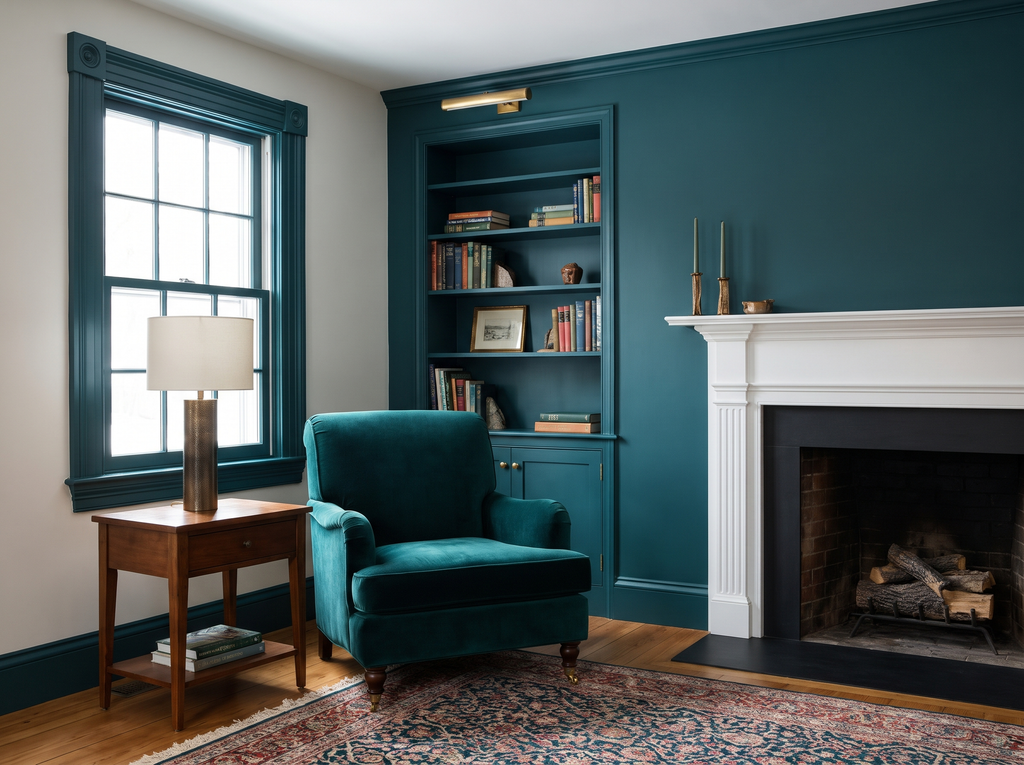
An accent wall or painted built-in gives a deep color a defined place in the room. We favor a wall with an existing focal point, such as a fireplace, so the color supports the layout.
For a larger furniture change, consider a velvet chair in your palette’s main shade. Check the fabric’s care instructions and durability details before ordering. If you rent, get permission before painting walls or trim.
Test Your Palette in Daylight and Warm Evening Light

We recommend placing paint samples and fabric swatches beside your sofa in morning light, afternoon light, and after sunset. Check them vertically where they will be used.
Around 2700K is a useful starting point for warm evening bulbs, though their yellow cast changes how colors read. Cream may look more golden, while sage shifts toward olive. Test with your actual lamps before committing to paint or upholstery.
Avoid Flat Textures, Excess Darkness, and Exact Matching

Our preferred fix for a heavy-looking room is a broad light surface, such as a cream rug or pale curtains. A tiny white accessory has less visual impact beside dark walls and seating.
Mix velvet with wool or woven fabric to give similar colors different surfaces. Keep some variation between shades: a burgundy pillow and a faded wine-red rug coordinate without requiring an exact match.
Carry Your Fall Palette into the Holidays

We recommend keeping your main textiles through the holidays and changing a few decorative accents. Metallic ornaments and seasonal greenery extend these palettes into winter with little rearranging.
Pair Burgundy with Brass and Chocolate with Paper Stars
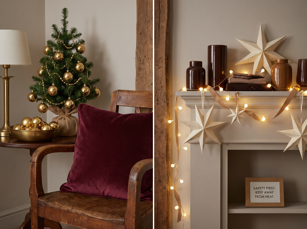
Burgundy cushions work well beside brass ornaments on a small tree or in a shallow bowl. We would repeat the metal finish in an existing lamp or frame to connect the holiday accents to the room.
For chocolate and caramel, choose cream paper stars and warm-white string lights. A tan ribbon echoes the upholstery palette. Keep paper decorations clear of candles, fireplaces, and other heat sources.
Layer Oxblood and Olive with Seasonal Greenery

Oxblood ribbon and evergreen branches deepen the olive palette while keeping its earthy character. Our preference is a loose arrangement in a sturdy ceramic vessel, with enough open space to show the branches.
Eucalyptus adds a softer gray-green note beside olive green cushions. Use fresh greenery where you can monitor shedding, keep it clear of heat, and choose flameless candles for nearby displays.
Start with One Palette and a Few Simple Swaps

Our recommendation is to choose the fall color palette that already shares a shade with your sofa, rug, or wood furniture. Begin with two pillow covers and one throw, then check their colors in daylight and evening light.
Keep natural textures in the mix, and give dark accents enough light-colored space to remain visible. Before adding a larger piece, review the room from the doorway to see whether your chosen colors feel balanced.
Frequently Asked Questions
Our quick recommendations address color choice, room size, and ways to work with existing seating.
What are moody fall colors for a living room?
We describe moody fall colors as deep or muted shades such as burgundy, chocolate, plum, olive, and navy. Warm brown and cream provide supporting tones that make those richer colors easier to use across a living room.
Which moody fall palette feels the most calming?
Our pick for a calm look is plum and dusty sage with a warm gray base. Keep plum to small accents and test the sage in your room, especially if daylight is limited.
Can I use a moody palette in a small or dark living room?
Yes, we recommend using rich colors in focused areas while keeping a substantial light surface near the seating. A pale rug or curtains provide that balance, and lamps at different heights help reveal the colors after sunset.
How do I add fall colors to a beige or gray sofa?
For beige seating, we favor burgundy or chocolate accents that connect with its warmth. For a gray sofa, try plum and sage or mustard and navy, using a patterned pillow to connect the upholstery color with the new shades.
Do these fall palettes work beyond autumn?
Yes, we recommend these combinations for year-round rooms, with seasonal changes handled through smaller accessories. Keep the main textiles and refresh branches or decorative accents as the seasons change. Save your favorite palette for your next refresh, and tell us: Which palette would you try?